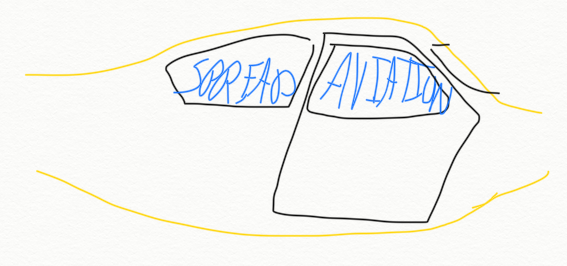
Finally! It took a number of months, but Plane Talk Podcast is officially no more with the launch of our new website, social media accounts, and most importantly, our new Spread Aviation logo.
Rob and I knew nothing about logo design. Logo creation for other companies we’ve worked on in the past were either out of our realm of responsibility, handed down to us, or simply not as important from a brand perspective. Spread Aviation is about… spreading aviation, and it’s super important for us to build a brand and image that people trust and will continue to trust for years ahead.
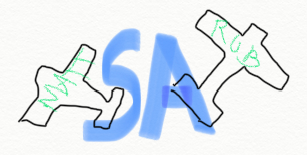
At first glance, the thing you’ll notice most about the logo is that it’s orange, has lots of arrows, and looks like an S. But there’s meaning behind every aspect of the logo:
- The S Shape: The logo is indeed shaped like an S, but that’s not for Spread. The S is actually a symbol of Aviation Safety, our primary focus.
- The Four Arrows: While not entirely at 90 degree angles, the four arrows represent the four forces of flight: lift, thrust, weight & drag. Notice that none of the arrows point directly up, down, left, or right? This is to symbolize these forces outside the realm of straight and level flight.
- The Three Parallel Lines: Symbolizes formation flying, of course!
- The Single Line With Two Arrows: On top of symbolizing thrust & drag, this line represents two-way exchange of knowledge. Our company is founded by an instructor and his student. While students are often the ones asking questions, CFIs learn from students all the time (and must continue to learn). It’s a two-way street!
- The Sharp 60° Angles: The most important part of our logo! These “turns” represent our ultimate goal of changing the direction of (and improving!) Aviation Safety Education.
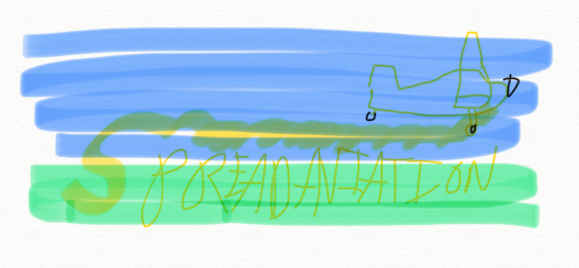
Just in case you’re curious, here were the runners up Rob hand drew one night while half asleep. I think we’ll stick with the one we’ve got!